Friday, 27 June 2014

The Shape of a Story - keeping it simple

How we shape our stories is a vital part of our ability to connect with readers. In this humorous presentation, Kurt Vonnegut reduces the story arc to a few strokes. What I love about this is its simplicity. As a novelist I often get embroiled in over complicated plots, multiple timelines and different points of view.

What the video taught me was to look at  my main characters' tension arcs through the novel. Even with a not very exact representation of this (see below) I could see where the 'dead' points might be for the reader, and where there was too much going on.

The timeline runs left to right and the peaks represent crux points for that character. It took less than three minutes to do, but was nevertheless very informative. As I often work with historical characters, sometimes their peaks and troughs are determined by the history I'm dealing with. In my last novel it was real events in WWII. This can lead to imbalance in story structure which needs to be addressed, but it can be invisible unless you take a quick overview.

As you can see, Character No.3 particularly has a lot of action near the beginning, but not much through most of the middle of the book, reappearing at the end but not with enough impact to compete with the other two major characters. I had to either lose this character altogether or strengthen his role in the novel.

My four hundred page novel reduced to a few squiggly lines might seem laughable, but as Kurt Vonnegut points out, if it works for the New Testament, why not for me?!

What deceptively simple writers techniques do you use when writing?

Wednesday, 25 June 2014

The wonderful efficiency of CreateSpace

The proof copy of my paperback has finally arrived. When I say finally, I am exaggerating, because from uploading it to receiving the proof copy here in the UK took less than a week. All the way from the US to the UK!

And I am thrilled with the way it was packaged and delivered - and even better - thrilled with the way the book looks and feels. Apart from the fact that the cover can't have fancy embossing or anything like that (even if I could afford it) - the book looks exactly like a traditionally published novel. The paper quality is the same as the ones on my shelf, and the binding is not too tight to make reading difficult, nor so loose I fear I might lose some pages. It was well worth all my soul-searching about sizes and colour of paper and font (see previous posts).
By the way, did you spot the loose/lose combination there? Proves I have taken my editing seriously....

Now of course I have to read the damn thing again. For the umpteenth time - to check all is well and there are no lurking typos or other glitches. It will take me longer to re-read it than CreateSpace took to send it, but I'm hoping to get caught up in it at least once to the extent that I forget I'm supposed to be proofing. The sign of a good novel! Which of course means I'll have to go back and read it again. Then I can get some copies out to reviewers, and get some of that stuff you paint on your fingernails to stop me from biting them.

Then I might have hands like the ones on the left, though what the rest of their bodies are doing is anyone's guess!

Wednesday, 11 June 2014

Writers struggle - it's a fact #amwriting


I was heartened to listen to 'One to One' the other day on Radio 4 and hear AL Kennedy talking to Rachel Johnson about writing. In it, both Rachel and Alison talk about the struggle that is their daily writing life. The programme is only 15 minutes and well worth a listen. A few nuggets of inspiration in there too. If nothing else it will demonstrate that whatever your particular writing struggle right now, YOU ARE NOT ALONE!
Here's the link.
http://www.bbc.co.uk/programmes/b04581jc
and  AL Kennedy's website
In the programme Alison also mentions a special writing chair which she uses where the head is lower than the feet. Could it be this? Or this? Both seem a little extreme!
www.back2.com
Ergonomic workstations

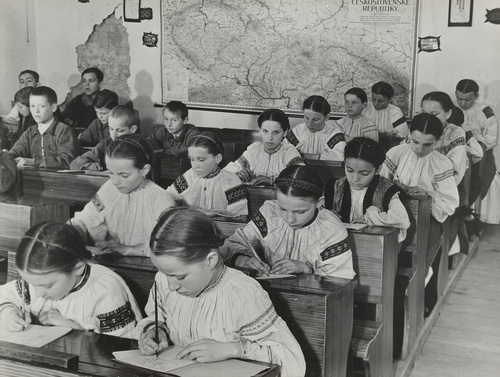
The old-fashioned way before computers has something to recommend it too. I envy those young people scribbling away, for whom writing is still a joy. They have none of the angst and soul-searching that goes on when you're trying to write something as long and complicated as a novel. Just 'What I did on my holidays' though actually today it's probably, 'How I used my ipad and smartphone on my holidays.'

But whatever your desk and chair are like, however flashy your computer, I guess you will still have to suffer the pain of you and your novel, and find from somewhere the sheer persistence that gets the thing written.

The 'One to One' series also has another episode in which Rachel Johnson, who writes comedy, talks to Michael Frayn about farce - if you're writing something funny, here's the link http://www.bbc.co.uk/programmes/b045z8wd


Please tell me if you use any special chair for writing, or other writer's aids that you use to ease the physical and mental pain!

Wednesday, 4 June 2014

Post and Packing - how to package a book for review

So, I've just ordered a proof copy of my book and I'm waiting to receive it. Once it arrives, if it's OK, I shall order more and be sending them out for review. I hope many reviewers will choose epub or mobi versions, but a few will want the paperback. (I have to say I have sweated blood over the paperback to make it as much like a trad-published book as possible. This is because that's what the reading public expect - a good cover, well-edited content, thoughtful presentation. After all, I hope readers will be actually paying me money for it.)
P1140227Posting the Book
Although I love the idea of recycling, I always think it looks a little untidy when sending review copies out, to have sellotaped, re-used bags. What do you think? Do you always buy new envelopes, or recycle ones from your enormous online ordering history? Do you care if the person is saving the planet or would you rather receive a pristine envelope? If you receive a recycled envelope do you imagine a tree-hugger with a garden full of organic veg and a wind turbine in the garden, and possibly dungarees and dreadlocks? Or do you imagine an impoverished single mum scraping together her last few coins to send you a book that she hopes will be paying the bills to put her kids through education?

Okay, okay, I'm getting a bit carried away here. I guess being professional is the answer. A nice neat new envelope then. But it's an interesting question - how much does the packaging affect your perception of the product? Do you actually like Amazon's cardboard envelopes?

And then - decisions, decisions!  First class or second class. Does second class make me look like a penny pinching miser? First class definitely gives the impression I care enough for it to get there quickly.

Internal contents
Someone suggested that I should include an A4 sheet with more information about the book along with the review copy. Another friend suggested postcards that the reviewer can give to friends. I have to say I'm favouring the former right now. But too much stuff in the envelope (as a reviewer) might make me suspicious that the author/publisher is trying too hard. Especially if it's stuffed with banknotes. Ha! Chance would be a fine thing.

Feel free to tweet me @davina_blake with any advice about packaging books for review. Or to tell me to get a life!

The photo of wrapped books is from Nic Freeman's Blog in which he randomly posted copies of a book to five people. That sounds a nice idea. And the picture below is linked to Elizannie's Blog in which she gives a potted history of the Post and discusses the privatisation of the Royal Mail. My postie certainly works hard dragging all my orders from the big A to my front door!

Postman

Sunday, 1 June 2014

Sunday Post - What to do when Writing is your Religion

It occurred to me that writers can be evangelical in their attitudes towards writing, and that they fall into these main camps:


Buddhist : All writing is suffering.
Taoist: Outlining? Forget it. I just go with the flow.
Zen: I sit and wait for an  idea to hit me on the back of the head from nowhere.
Jewish: My editor always gives it a Passover.
Christian: I destroyed my manuscript on Friday, but it will rise again.
Paganism: I rely on my natural voice.
Unitarianism: All stories are the same story told in different ways.
Hinduism: I will reincarnate as another pen-name.
Catholicism: I confess all in my memoir.
Atheism: There's no such thing as a born writer.

Any other suggestions? (Note to fanatics - this post is supposed to make you laugh.)

Wednesday, 21 May 2014

The Spies of Warsaw by Alan Furst - book review #WWII

I'm not usually a reader of espionage novels, but having enjoyed Red Joan, I saw this on offer in our charity shop and decided to give it a try. Set in 1937 in Poland, just before the outbreak of WWII,  the book tells the story of Mercier, a French military attache and spy, and what happens when he accidentally saves Edward Uhl, a German engineer and secret agent, from assassination.


The book is complex - you have to have your wits about you to get your head around all the names, and to understand who's on whose side. The book is incredibly well-researched - I just believed in it all, the faded apartments, the stuffy restaurants, the cold of Poland. What the novel conveys really well is the fragile existence of a spy's identity. At any moment he can be asked to assume a new name, a new history, and leave for a new country. 


Unsentimental but realistic, the tension built and built and kept me flipping the pages.The plot is convoluted  and involves spying on the design and building of German Tanks, so I won't elaborate here. There is a nice balance of male and female characters though, with Anna, Mercier's lover, particularly well-drawn. A gripping read - recommended.

Listen to the Audio Book here

I had no idea the book had been made into a TV drama, which somehow I must have missed. Did anyone see it? Here is a quick reminder. It looks great, and now I have read the book I might make the effort to watch it. And - added bonus, it stars David Tennant!

Monday, 19 May 2014

My Baptism into Fonts (groan) #amwriting


Coco Chanel

So I have sent my lovely book off to be typeset and laid out by a pro, and have spent many weeks looking at the inside of books, none of which so far have had any kind of 'standard' layout as far as I can see - they do vary enormously.

But - getting the font right and the chapter headings of your book looking decent is essential. The font says so much about whether your book is literary or commercial, modern or old-fashioned. The chapter headings give a flavour of the type of book the reader can expect.

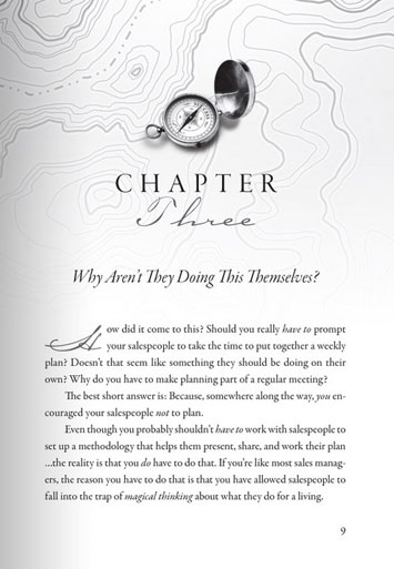
chapter-heading-9
Illustrated Chapter Heading
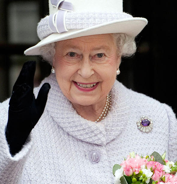
If you are briefing a designer who is on the other side of the ocean and therefore not able to see your pointing finger, remember that a brief to produce something 'simple and classic' can be interpreted in several ways. Like telling Coco Chanel to wear something 'simple and classic' or telling the Queen to wear something 'simple and classic' - the results can be very different depending on who is interpreting them.


Drop capitals


Also bear in mind that designers like design - i.e. they might want to squeeze as many fancy ideas for fonts as possible - curlicued chapter-headings, drop-capitals, twiddly numbers, and the end result can be distracting rather than enhancing for the reader.


There are obviously different interpretations and so if you are leaving this to someone else, your brief must be clear and if possible you should give examples of interiors you have liked. I looked through hundreds of paperbacks of a similar feel and genre in my local charity shop. (It's ok, I did buy a few afterwards.)

From this I saw that too much illustration and design, and the book ends up looking like a children's or young adult novel. Too little and it looks like it has not been designed at all.

If you don't know what you want until you see it (that was me, I'm afraid) then this site has a selection of 50 templates ready for use along with the instructions about how to format your document in Word. Well worth a look even if you are asking a designer to format your book.