Friday 27 June 2014

The Shape of a Story - keeping it simple

How we shape our stories is a vital part of our ability to connect with readers. In this humorous presentation, Kurt Vonnegut reduces the story arc to a few strokes. What I love about this is its simplicity. As a novelist I often get embroiled in over complicated plots, multiple timelines and different points of view.

What the video taught me was to look at  my main characters' tension arcs through the novel. Even with a not very exact representation of this (see below) I could see where the 'dead' points might be for the reader, and where there was too much going on.

The timeline runs left to right and the peaks represent crux points for that character. It took less than three minutes to do, but was nevertheless very informative. As I often work with historical characters, sometimes their peaks and troughs are determined by the history I'm dealing with. In my last novel it was real events in WWII. This can lead to imbalance in story structure which needs to be addressed, but it can be invisible unless you take a quick overview.

As you can see, Character No.3 particularly has a lot of action near the beginning, but not much through most of the middle of the book, reappearing at the end but not with enough impact to compete with the other two major characters. I had to either lose this character altogether or strengthen his role in the novel.

My four hundred page novel reduced to a few squiggly lines might seem laughable, but as Kurt Vonnegut points out, if it works for the New Testament, why not for me?!

What deceptively simple writers techniques do you use when writing?

Wednesday 25 June 2014

The wonderful efficiency of CreateSpace

The proof copy of my paperback has finally arrived. When I say finally, I am exaggerating, because from uploading it to receiving the proof copy here in the UK took less than a week. All the way from the US to the UK!

And I am thrilled with the way it was packaged and delivered - and even better - thrilled with the way the book looks and feels. Apart from the fact that the cover can't have fancy embossing or anything like that (even if I could afford it) - the book looks exactly like a traditionally published novel. The paper quality is the same as the ones on my shelf, and the binding is not too tight to make reading difficult, nor so loose I fear I might lose some pages. It was well worth all my soul-searching about sizes and colour of paper and font (see previous posts).
By the way, did you spot the loose/lose combination there? Proves I have taken my editing seriously....

Now of course I have to read the damn thing again. For the umpteenth time - to check all is well and there are no lurking typos or other glitches. It will take me longer to re-read it than CreateSpace took to send it, but I'm hoping to get caught up in it at least once to the extent that I forget I'm supposed to be proofing. The sign of a good novel! Which of course means I'll have to go back and read it again. Then I can get some copies out to reviewers, and get some of that stuff you paint on your fingernails to stop me from biting them.

Then I might have hands like the ones on the left, though what the rest of their bodies are doing is anyone's guess!

Wednesday 11 June 2014

Writers struggle - it's a fact #amwriting


I was heartened to listen to 'One to One' the other day on Radio 4 and hear AL Kennedy talking to Rachel Johnson about writing. In it, both Rachel and Alison talk about the struggle that is their daily writing life. The programme is only 15 minutes and well worth a listen. A few nuggets of inspiration in there too. If nothing else it will demonstrate that whatever your particular writing struggle right now, YOU ARE NOT ALONE!
Here's the link.
http://www.bbc.co.uk/programmes/b04581jc
and  AL Kennedy's website
In the programme Alison also mentions a special writing chair which she uses where the head is lower than the feet. Could it be this? Or this? Both seem a little extreme!
www.back2.com
Ergonomic workstations

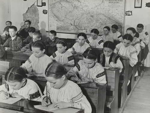
The old-fashioned way before computers has something to recommend it too. I envy those young people scribbling away, for whom writing is still a joy. They have none of the angst and soul-searching that goes on when you're trying to write something as long and complicated as a novel. Just 'What I did on my holidays' though actually today it's probably, 'How I used my ipad and smartphone on my holidays.'

But whatever your desk and chair are like, however flashy your computer, I guess you will still have to suffer the pain of you and your novel, and find from somewhere the sheer persistence that gets the thing written.

The 'One to One' series also has another episode in which Rachel Johnson, who writes comedy, talks to Michael Frayn about farce - if you're writing something funny, here's the link http://www.bbc.co.uk/programmes/b045z8wd


Please tell me if you use any special chair for writing, or other writer's aids that you use to ease the physical and mental pain!

Wednesday 4 June 2014

Post and Packing - how to package a book for review

So, I've just ordered a proof copy of my book and I'm waiting to receive it. Once it arrives, if it's OK, I shall order more and be sending them out for review. I hope many reviewers will choose epub or mobi versions, but a few will want the paperback. (I have to say I have sweated blood over the paperback to make it as much like a trad-published book as possible. This is because that's what the reading public expect - a good cover, well-edited content, thoughtful presentation. After all, I hope readers will be actually paying me money for it.)

P1140227Posting the Book
Although I love the idea of recycling, I always think it looks a little untidy when sending review copies out, to have sellotaped, re-used bags. What do you think? Do you always buy new envelopes, or recycle ones from your enormous online ordering history? Do you care if the person is saving the planet or would you rather receive a pristine envelope? If you receive a recycled envelope do you imagine a tree-hugger with a garden full of organic veg and a wind turbine in the garden, and possibly dungarees and dreadlocks? Or do you imagine an impoverished single mum scraping together her last few coins to send you a book that she hopes will be paying the bills to put her kids through education?

Okay, okay, I'm getting a bit carried away here. I guess being professional is the answer. A nice neat new envelope then. But it's an interesting question - how much does the packaging affect your perception of the product? Do you actually like Amazon's cardboard envelopes?

And then - decisions, decisions!  First class or second class. Does second class make me look like a penny pinching miser? First class definitely gives the impression I care enough for it to get there quickly.

Internal contents
Someone suggested that I should include an A4 sheet with more information about the book along with the review copy. Another friend suggested postcards that the reviewer can give to friends. I have to say I'm favouring the former right now. But too much stuff in the envelope (as a reviewer) might make me suspicious that the author/publisher is trying too hard. Especially if it's stuffed with banknotes. Ha! Chance would be a fine thing.

Feel free to tweet me @davina_blake with any advice about packaging books for review. Or to tell me to get a life!

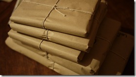
The photo of wrapped books is from Nic Freeman's Blog in which he randomly posted copies of a book to five people. That sounds a nice idea. And the picture below is linked to Elizannie's Blog in which she gives a potted history of the Post and discusses the privatisation of the Royal Mail. My postie certainly works hard dragging all my orders from the big A to my front door!

Postman

Sunday 1 June 2014

Sunday Post - What to do when Writing is your Religion

It occurred to me that writers can be evangelical in their attitudes towards writing, and that they fall into these main camps:


Buddhist : All writing is suffering.
Taoist: Outlining? Forget it. I just go with the flow.
Zen: I sit and wait for an  idea to hit me on the back of the head from nowhere.
Jewish: My editor always gives it a Passover.
Christian: I destroyed my manuscript on Friday, but it will rise again.
Paganism: I rely on my natural voice.
Unitarianism: All stories are the same story told in different ways.
Hinduism: I will reincarnate as another pen-name.
Catholicism: I confess all in my memoir.
Atheism: There's no such thing as a born writer.

Any other suggestions? (Note to fanatics - this post is supposed to make you laugh.)

Wednesday 21 May 2014

The Spies of Warsaw by Alan Furst - book review #WWII

I'm not usually a reader of espionage novels, but having enjoyed Red Joan, I saw this on offer in our charity shop and decided to give it a try. Set in 1937 in Poland, just before the outbreak of WWII,  the book tells the story of Mercier, a French military attache and spy, and what happens when he accidentally saves Edward Uhl, a German engineer and secret agent, from assassination.


The book is complex - you have to have your wits about you to get your head around all the names, and to understand who's on whose side. The book is incredibly well-researched - I just believed in it all, the faded apartments, the stuffy restaurants, the cold of Poland. What the novel conveys really well is the fragile existence of a spy's identity. At any moment he can be asked to assume a new name, a new history, and leave for a new country. 


Unsentimental but realistic, the tension built and built and kept me flipping the pages.The plot is convoluted  and involves spying on the design and building of German Tanks, so I won't elaborate here. There is a nice balance of male and female characters though, with Anna, Mercier's lover, particularly well-drawn. A gripping read - recommended.

Listen to the Audio Book here

I had no idea the book had been made into a TV drama, which somehow I must have missed. Did anyone see it? Here is a quick reminder. It looks great, and now I have read the book I might make the effort to watch it. And - added bonus, it stars David Tennant!

Monday 19 May 2014

My Baptism into Fonts (groan) #amwriting


Coco Chanel

So I have sent my lovely book off to be typeset and laid out by a pro, and have spent many weeks looking at the inside of books, none of which so far have had any kind of 'standard' layout as far as I can see - they do vary enormously.

But - getting the font right and the chapter headings of your book looking decent is essential. The font says so much about whether your book is literary or commercial, modern or old-fashioned. The chapter headings give a flavour of the type of book the reader can expect.

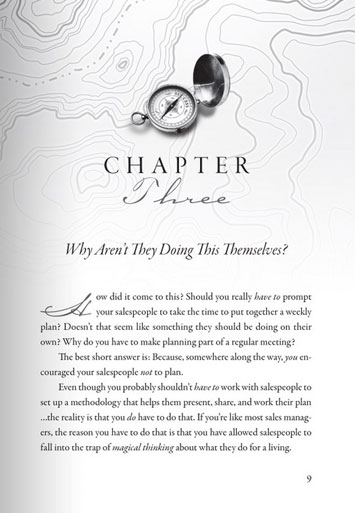
chapter-heading-9
Illustrated Chapter Heading
If you are briefing a designer who is on the other side of the ocean and therefore not able to see your pointing finger, remember that a brief to produce something 'simple and classic' can be interpreted in several ways. Like telling Coco Chanel to wear something 'simple and classic' or telling the Queen to wear something 'simple and classic' - the results can be very different depending on who is interpreting them.


Drop capitals


Also bear in mind that designers like design - i.e. they might want to squeeze as many fancy ideas for fonts as possible - curlicued chapter-headings, drop-capitals, twiddly numbers, and the end result can be distracting rather than enhancing for the reader.


There are obviously different interpretations and so if you are leaving this to someone else, your brief must be clear and if possible you should give examples of interiors you have liked. I looked through hundreds of paperbacks of a similar feel and genre in my local charity shop. (It's ok, I did buy a few afterwards.)

From this I saw that too much illustration and design, and the book ends up looking like a children's or young adult novel. Too little and it looks like it has not been designed at all.

If you don't know what you want until you see it (that was me, I'm afraid) then this site has a selection of 50 templates ready for use along with the instructions about how to format your document in Word. Well worth a look even if you are asking a designer to format your book.

Tuesday 13 May 2014

UK Book Sizes and Whiter than White Paper

If you want to self- publish you need to take into account standard book sizes.

I was slightly peeved to discover that if I wanted my novel to be printed by CreateSpace or Lightning Source to look like an english paperback, it could only be printed on white paper. This of course makes it unlike any other novel published in the UK which are all printed on cream paper.

Only non-fiction is printed on white.

The standard size for a UK paperback is 7.75 x5 inches (181 mm x 111 mm) - or near enough. I know because I've been measuring paperbacks all week! Standard sizes in the UK are different from standard sizes in the US.
US books are bigger. (Maybe they have bigger houses and bigger bookshelves?!)

The mysteries of paper sizing, with fancy words such as 'folio' and 'octavo' are listed here on Trussel's booksize website. Meanwhile, here is some pictorial help:

 left to right, standard UK paperback, standard US paperback,
self published UK paperback, self-published US paperback, blockbuster UK Airport edition
Nothing on earth explains why publishers seem to think a book needs to be extra large when you are about to get on a plane!

So what should I do?
a.Have the book wider than the average UK paperback so it sticks out on the shelf.
b.Have the book taller than the average paperback so that it looks long and thin.
c.Have white paper and  supply free sunglasses to every reader, plus make it an extra large book as you might as well send readers to the airport if they'll need the sunglasses anyway. . .

The most popular US size seems to be 9x6, which means that the book can look a little floppy given that the card used for the covers in Print On Demand books is usually thinner than on most bookshop paperbacks. (The covers also tend to be horribly shiny, or slimily matt, but that's another issue - more on that in another post.)

In the end I opted for 8 x 5.5 which is a standard size in the US and can be printed on cream paper. This makes it close-ish to a UK size, just a little taller and wider. Of course it would be less pages if it was 9 x 6, (see the fourth book along) and therefore cheaper to produce, but it might end up floppy, and I want quality, so decided to pay more to get the effect I want, which is as near to standard as possible.
More about self-publishing and print on demand? Karen Inglis's excellent site might be of use.

I have no idea whether paperbacks have always been the size they are now. I seem to remember some Penguin books being smaller, but I might be mistaken. But whilst trying to find out, I came across this: -Apparently by the 1950's it was common to hire people to illustrate scenes from the book, no matter how ridiculous, or no matter how much more appropriate a photo would have been. Needless to say, I shall not be following this example on the left, which according to http://vintagepaperbackarchive.com/blog/ wins the prize for the most ridiculous use of original artwork. I love the attempt to generate an interest in the reader through the swishing brooms and lurid colour.


Thursday 8 May 2014

The Writer's Indispensable Technology - Sticky Post-its


Stacks of WWII research books waiting for post-its

I don't know how I'd manage without my sticky post-its. Like most writers who delve into the past I'm surrounded by a pile of research books, some of which are useful and some of which are very useful. My method when I find something that is specifically useful to my novel is to mark the page with a skinny post-it right next to the sentence I need. I scrawl on the post-it to remind me what the research pertains to. In my case, writing about WWII, it is things such as 'Home Guard', 'Food', 'Pacifists', 'Army Life', or just '*!' - which means 'No! Really? Definitely include this!'
'One Family's War' with the post-it treatment -
yes that was incredibly useful book
And below you can see my proofread manuscript - all 436 pages of it, marked up with post-its. I think I said in previous posts that I had asked multiple friends to proof-read my novel now that it has been copy-edited. I thought (as we all do) that it was perfect, and would need hardly any work. (Me being anal about sprlling, punturation andf grammer)Well, my friends thought differently and here you can see the post-its to prove it. Actually, most of those post-its indicate the placing of commas. It seems some people love 'em and want you to put in loads more, and some hate 'em and want you to remove them all - unless the sentence doesn't make sense without them. So, many of those post-its are about the Great Big Comma Debate.
My 'perfect' manuscript after proofreading by eagle-eyed
writerly friends
But marking-up everyone's comments on a single draft is a good idea. I can enjoy making a fringe with all those post-its, and it does show me exactly where I need to look when I'm going through my manuscript for the gazillionth time.

You'll be glad to know decisions have been made about all those extra/missing commas, and the manuscript has now gone to be formatted. Which is a whole other ball game. More about my journey into the subliminal messages of typography soon. How we have moved on! Apparently J B Priestley's manuscripts were typed up for him by a 'soft-hearted' typist who worked in the office nearby. His chief aid seems to have been dress-makers pins by the look of his papers. Sadly, those days are gone, I prefer post-its to pins, and this soft-hearted girl will be typing and formatting her own manuscript.

Priestley's scribbling books and typescripts
JB Priestley's scribbling books - editing the old-fashioned way

Thursday 24 April 2014

Only ten guineas - fee for the original London Underground Map

I've been thinking about the design and layout of my book, and whilst mulling over things like where to put the biography, (front or back in the e-book?) and which side of the page the recommended reading list should go and so forth, I came upon a book which told me about the design of maps. (More about that book later.)

I was immediately taken with the London Underground Map, and reading about it made me realise that good design (in maps and in books) is more about functionality than attractiveness.

The first London Underground Map was groundbreaking because it did away with the ideas of scale, and showing features that might be above the ground, because they were unnecessary and invisible to the travellers. Instead he just evened out the stops to make them fit on the circuits or lines, and kept only the essentials, ie the actual stations. The only feature remaining is the river Thames which gives a pleasing aesthetic appearance and shows whether you are north or south of the river.

And I say 'circuits' with inside knowledge bnecause the map was designed by an electrician.Harry Beck who designed it worked as an electrical draughtsman the Engineers department of London Trasport, and applied his knowledge of circuitry to design this map in 1933.

Now it is an icon and has changed little since then.
He was paid ten guineas for it - a guinea was one pound and one shilling - surely the bargain of the century!
1933 underground map
Harry Beck's Design
On his map above there are some ghost stations though, such as The British Museum station, Dover Road, and more recently Aldwych station, which  closed in 1994. This station is still used though - not for trains, but for TV companies needing to film inside a tube station.

And it occurred to me that designing an ebook is like designing this map - you have to think about what is really necessary and junk the rest.
So what groundbreaking thing will I have in my design? Well, it seems to me that nowhere in any ebook, once it arrives on my kindle, is there a trace of the blurb which originally enticed me to buy the book. Which is pretty annoying as I can't always just remember what attracted me from its title alone.The back cover blurb would be really useful.
So I shall probably try to have that in there somewhere - only question is, where? Front, so it is the first thing you see when you are looking for something to read? Or back, where it would go in a tradirtional paperback? What do you think?

And now - the book from which I gleaned this information about the tube map - 'Maps that Made History' by Lez Smart. Subtitled The influential, the eccentric and the sublime, this is a wonderful book which includes such catographic gems as the spa holiday resoprts in the Roman Empire, the location of Eldorado, and a map of the Battle of Culloden. Lots of maps and pictures and quirky information which I am sure would delight the QI elves.


Monday 21 April 2014

Book brilliantly evokes the 1950's fear of Nukes

I remember when I was a child the fear of nuclear weaponry was so much more obvious than it is now. People joined CND, wore Ban the Bomb stickers on their car windows and bumpers, and wore the symbol around their necks to show their solidarity with the campaign for nuclear disamament.

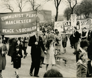
CPGB CND demo
CND Demo
According to one blog (click on CND picture for whole article)
'The CND emerged from a set of historic developments, which cumulatively worried many British people. One of these key events was the mass publication of America’s official photographs of an earlier thermonuclear test in spring 1954. Several newspapers reverted to religious language to describe the bomb. The Daily Mirror’s star columnist, William Connor, adopted an apocalyptic tone in his ‘Cassandra’ column. He wrote:
WELCOME, Dear Bomb. Welcome and bless you.

Bless those who made you. Bless those who set you roaring and flaming and vaporising the face of the earth.

Bless the hellish heat of you. Bless the bursting heart of you (29 March 1954: 7).


Australian women marching in 1954
Since then, I've grown up, had my family, and these concerns seem to have gone away into the background, no longer part of the current Zeitgeist. And it was only when I picked up 'Red Joan' by Jennie Rooney and began reading that I was taken back to those days. Red Joan is a fantastic book, taking as its central premise the idea that a woman who has access to the secret of the making of the atom bomb might be pressurised to reveal that information, and how her allegiances might shift as political events unfold through her life.

Red Joan is loosely based on the real life spy Melita Norwood, who was only rumbled once she reached the ripe old age of  87 years, Red Joan takes us from the 1930's at Cambridge university to the later years of Joan's life, by which time she is living a perfectly ordinary suburban existance in Sidcup in Kent.

Melita Norwood
Melita Norwood
In an interview with the Telegraph, in which you can read more, Mrs Norwood said:

"I did what I did not to make money," she told me, "but to help prevent the defeat of a new system [Communism] which had, at great cost, given ordinary people food and fares which they could afford, a good education and health service. I thought that perhaps some of what I had access to might be useful in helping Russia to keep abreast of Britain, America and Germany."

Very rarely do we consider what might motivate a person who sells our secrets to a foreign power, but this book conveys it brilliantly - all the grey areas, the atmosphere of fear, the personal and romantic relationships that exercise an inexorable pull on our choices. And very rarely do we consider that a spy might be ulimately altruistically motivated.

For those of you that remember this era, and those who do not, I heartily recommend this gripping and insightful book.


Wednesday 19 March 2014

Dream job of the 1960's - librarian


As a child I was brought up to visit my library regularly on a Saturday morning and to come out with brain food for the week whilst my mother shopped for real food at the local supermarket. In those days libraries were hallowed places of learning where you spoke in whispers in case you disturbed people who were reading or studying. Books were stamped out with a manual date stamp and a little ticket would be taken from a beige-coloured flap at the front of the book and filed away under your name in an index system. This made the librarian appear to be some sort of official - all that stamping with a satisfying 'thunk'! In my young mind then the librarian was a sort of friendly dictator with absolute control over the world of books.


No wonder then that top of my list of dream jobs as a nine-year-old was - librarian.

At home, we often used to play 'libraries' (yes, sad I know, what a geek) by making tickets and cards for all our books and pretending to be the lady at the counter. Quite a few of my childhood books have flaps stuck in the front so we could 'stamp' them using a stamp from my father's office.

Haldane Room Old Library 1950s LIS Library PD

As a writer whose publishing world is becoming increasingly digital, I mourn the loss of books from shelves and into devices, at the same time appreciating that this brings so many more books into the hands of so many more people. Think of remote villagers in the developing countries who are reading on their phones - fantastic!

But as a writer thinking of self-publishing, I recognise that without distribution the only way a POD book will probably get into my local library is if I take copies and donate them myself. This will give me no return and in fact cost me money - but I think of it as a payback, for all the years of reading pleasure that libraries have given me. And it would give me great pleasure to have my book on a real as well as a digital shelf. Shame that it will never have a stamp  - red =overdue!

Friday 14 March 2014

Glove stretchers - a helping hand


In my mother's era (which my daughter assures me was The Dark Ages), everyone wore gloves and carried a handbag that matched their shoes. I don't think I have any accessories that match, they are all a random collection of scarves and gloves, usually designed to keep out the cold, and mostly lacking in any recogniseable style.

The most popular colour for gloves in the early twentieth century was white, which supposedly went with anything, but must have been a nightmare to keep clean. To keep them from dust, they lived in special glove boxes. Often the glove boxes had a space in the lid for glove-stretchers.

So what is a glove stretcher?

The most hardwearing were kid and leather gloves, but these turned stiff and wrinkled after washing, so glove-stretchers were needed to bring them back to shape. This is what they looked like, a sort of clothes-peg affair that you could push into the fingers.

This picture of some Victorian gloves with their stretcher came from www.denhams.com, the auctioneers, and weirdly enough was right next to a 'lady's Pith Helmet.' (estimate £20) I have visions of an intrepid lady explorer wearing these gloves - but obviously it must have been somewhere where they didn't have OMO (see previous post) because they look quite grubby. Maybe she wrestled an alligator into a swamp or something.

I always fancied a pair of long evening gloves, but these needed to be powdered so they would be easier to get on and off.  For this you would use a glove powdering flask - a wooden container shaped like a pepperpot to hold talcum powder. I have often seen these at antique fairs without their lids, and thought they were some sort of odd little vase, but now I know what they are really for.

This picture below of these patterns for gloves to sew is from www.myhappy sewingplace.com, so if you are hot with fabric, super-crafty or want vintage patterns why not pop over there and check out this great site.

In my last post I talked about going OMO (ok indie, if you must *sighs*), and paying for the copy-editing I needed. I'm not wealthy enough to stretch to that again for the proofreading, so I have asked for a helping hand (get it?!) from an army of writer friends to proofread my book and catch all the typos and glitches. Because I am hyper about spelling and apostrophes in the wrong places, and I am seriously fanatical about typos, I have gathered a small army to nit pick over the text. All those keen writerly eyes must be able to spot the things I missed. (Anyone spot anything in here?) So I am hoping that in the proofreading stage at least, many eagle eyes are as good as one professional.

Oh, and by the way, don't be expecting me to be saying 'buy my book' any time soon, these things take time, and I want to enjoy it rather than rush it. And from what I hear from indie authors, saying 'buy my book' is a fatal error, instead you should be engaging people. Well, OK, I said my post on gloves would be riveting, and it clearly isn't that, but it could be construed as mildly engaging.

'Construed,' now there's a good word.

My next post will be on 1950's Libraries - when librarians really did wear spectacles and ask you to keep quiet because 'other people are reading'.

Wednesday 12 March 2014

Mid list crisis causes dive into Indie waters

So why is the first post on this brand new blog about OMO? Well, it's because I am going it On My Own. In other words I have left the safe harbour of traditional publishing and I'm starting again from scratch with a new pen-name and a new blog.

Am I mad? Well you might think so, but my three books published with a large publisher are still languishing in the mid-list, despite their excellent five star reviews, and indie authors are extolling the virtues of the indie life. Except that the term indie sets my teeth on edge, as if we are all some kind of 1980's pop stars. So I prefer to say I am going OMO.

My book is finished, and my first shock was the cost of professional copy-editing. I asked the copyeditor of my other books what she charges and the answer nearly made me faint. She earns more in a week than I do with royalties from my books in a year. More than £20 an hour, which I know in any other business would be looked on as quite reasonable as an hourly wage. But somehow as writers we get used to not being paid very much, as trad publishing royalties are so small. Peanuts might be an improvement.

Maybe that will change! Maybe my mid-list crisis is really the beginning of something wonderful? And by the way, I will probably melt my visa card to pay for the edit. After all, I can trust in the quality of what I would be getting and I do want my book to be a quality publication.  Of course then I'll have to deal with the edits, but at least that is something familiar. Actually, if the editor is very nice about the book I send her, a little voice on my shoulder is whispering,  is that because now I am the one who is actually paying? Hmmm. Guess I might have to have a whole new relationship with people who do my edits, cover design etc. If I am paying, will they tell me if my ideas are rubbish, or just rub their hands in glee and snigger behind my back?

Anyway, here is Esther Williams looking gorgeous in one of her underwater scenes - how did she keep her hair like that underwater? And smile and keep her eyes open?

If you want more of Esther, the picture is linked to an obituary page for her, with many more fabulous pictures and info on her life and films - well worth a look.

Oh, and if you know any other trad published authors who are going OMO, please tell them to get in touch so we can hold hands through these treacherous indie waters!

Meanwhile I hope to keep you entertained with posts on all things old-fashioned and vintage. Friday's post will be about gloves. If you're yawning already, don't. I aim to make it riveting.

Monday 3 March 2014

1954 OMO washing powder - Old Mother Owl

When I was growing up there was always a packet of this on the kitchen windowsill, but I haven't seen it here in the UK for quite a few years, though I have seen Surf and Persil and various other Unilever products. Apparently it first appeared in 1954 and though discontinued here, it is still popular in other parts of the world.

Brazil, Turkey and Germany, Australia and Romania stll use OMO, and it has just been re-launched in Kenya where it was first available in 1953. In Pakistan the Surf brand has been so popular that it has entered the language and any washing powder is now 'surf' in Urdu!

According to Unilever's website, OMO was first registered in the United Kingdom as early as 1908, so it is the oldest laundry powder brand in the country. You won't believe it, but the acronym OMO which is a household name stands for “Old Mother Owl” - presumably because owls are associated with wisdom and it was supposed to mean you were making a wise purchase!

Actually, I remember making fake snow for our Christmas Yule Log table decoration by mixing OMO with water to form a snowy sludge. You can't do that with the new plastic capsules or tabs!

This is a great advert for Omo from 1960, in which 'all the girls' aprons' are sparkling white. 

More Vintage Omo images can be found at: http://sarahrussell.co.uk/2012/11/20/omo-makes-whites-bright/ 

From the Free online Acronym Dictionary:

OMO On My Own
OMO Open Market Operations
OMO Om Shanti Om (movie, India)
OMO Odd Man Out
OMO One Man Operated (now replaced by OPO)
OMO Other Military Operations
OMO Old Mother Owl
OMO Old Men Online (gaming community)
OMO Old Man Out
OMO Oracle Media Object
OMO Our Mother Ocean
OMO Oxford Millennium Orchestra
OMO Optical-Millimeterwave-Optical (TeraBurst)
OMO Operational Management Office


Any other suggestions anyone, for the OMO acronym?