Wednesday 21 May 2014

The Spies of Warsaw by Alan Furst - book review #WWII

I'm not usually a reader of espionage novels, but having enjoyed Red Joan, I saw this on offer in our charity shop and decided to give it a try. Set in 1937 in Poland, just before the outbreak of WWII,  the book tells the story of Mercier, a French military attache and spy, and what happens when he accidentally saves Edward Uhl, a German engineer and secret agent, from assassination.


The book is complex - you have to have your wits about you to get your head around all the names, and to understand who's on whose side. The book is incredibly well-researched - I just believed in it all, the faded apartments, the stuffy restaurants, the cold of Poland. What the novel conveys really well is the fragile existence of a spy's identity. At any moment he can be asked to assume a new name, a new history, and leave for a new country. 


Unsentimental but realistic, the tension built and built and kept me flipping the pages.The plot is convoluted  and involves spying on the design and building of German Tanks, so I won't elaborate here. There is a nice balance of male and female characters though, with Anna, Mercier's lover, particularly well-drawn. A gripping read - recommended.

Listen to the Audio Book here

I had no idea the book had been made into a TV drama, which somehow I must have missed. Did anyone see it? Here is a quick reminder. It looks great, and now I have read the book I might make the effort to watch it. And - added bonus, it stars David Tennant!

Monday 19 May 2014

My Baptism into Fonts (groan) #amwriting


Coco Chanel

So I have sent my lovely book off to be typeset and laid out by a pro, and have spent many weeks looking at the inside of books, none of which so far have had any kind of 'standard' layout as far as I can see - they do vary enormously.

But - getting the font right and the chapter headings of your book looking decent is essential. The font says so much about whether your book is literary or commercial, modern or old-fashioned. The chapter headings give a flavour of the type of book the reader can expect.

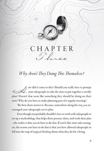
chapter-heading-9
Illustrated Chapter Heading
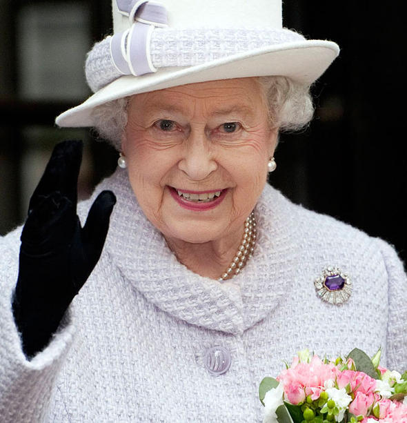
If you are briefing a designer who is on the other side of the ocean and therefore not able to see your pointing finger, remember that a brief to produce something 'simple and classic' can be interpreted in several ways. Like telling Coco Chanel to wear something 'simple and classic' or telling the Queen to wear something 'simple and classic' - the results can be very different depending on who is interpreting them.


Drop capitals


Also bear in mind that designers like design - i.e. they might want to squeeze as many fancy ideas for fonts as possible - curlicued chapter-headings, drop-capitals, twiddly numbers, and the end result can be distracting rather than enhancing for the reader.


There are obviously different interpretations and so if you are leaving this to someone else, your brief must be clear and if possible you should give examples of interiors you have liked. I looked through hundreds of paperbacks of a similar feel and genre in my local charity shop. (It's ok, I did buy a few afterwards.)

From this I saw that too much illustration and design, and the book ends up looking like a children's or young adult novel. Too little and it looks like it has not been designed at all.

If you don't know what you want until you see it (that was me, I'm afraid) then this site has a selection of 50 templates ready for use along with the instructions about how to format your document in Word. Well worth a look even if you are asking a designer to format your book.

Tuesday 13 May 2014

UK Book Sizes and Whiter than White Paper

If you want to self- publish you need to take into account standard book sizes.

I was slightly peeved to discover that if I wanted my novel to be printed by CreateSpace or Lightning Source to look like an english paperback, it could only be printed on white paper. This of course makes it unlike any other novel published in the UK which are all printed on cream paper.

Only non-fiction is printed on white.

The standard size for a UK paperback is 7.75 x5 inches (181 mm x 111 mm) - or near enough. I know because I've been measuring paperbacks all week! Standard sizes in the UK are different from standard sizes in the US.
US books are bigger. (Maybe they have bigger houses and bigger bookshelves?!)

The mysteries of paper sizing, with fancy words such as 'folio' and 'octavo' are listed here on Trussel's booksize website. Meanwhile, here is some pictorial help:

 left to right, standard UK paperback, standard US paperback,
self published UK paperback, self-published US paperback, blockbuster UK Airport edition
Nothing on earth explains why publishers seem to think a book needs to be extra large when you are about to get on a plane!

So what should I do?
a.Have the book wider than the average UK paperback so it sticks out on the shelf.
b.Have the book taller than the average paperback so that it looks long and thin.
c.Have white paper and  supply free sunglasses to every reader, plus make it an extra large book as you might as well send readers to the airport if they'll need the sunglasses anyway. . .

The most popular US size seems to be 9x6, which means that the book can look a little floppy given that the card used for the covers in Print On Demand books is usually thinner than on most bookshop paperbacks. (The covers also tend to be horribly shiny, or slimily matt, but that's another issue - more on that in another post.)

In the end I opted for 8 x 5.5 which is a standard size in the US and can be printed on cream paper. This makes it close-ish to a UK size, just a little taller and wider. Of course it would be less pages if it was 9 x 6, (see the fourth book along) and therefore cheaper to produce, but it might end up floppy, and I want quality, so decided to pay more to get the effect I want, which is as near to standard as possible.
More about self-publishing and print on demand? Karen Inglis's excellent site might be of use.

I have no idea whether paperbacks have always been the size they are now. I seem to remember some Penguin books being smaller, but I might be mistaken. But whilst trying to find out, I came across this: -Apparently by the 1950's it was common to hire people to illustrate scenes from the book, no matter how ridiculous, or no matter how much more appropriate a photo would have been. Needless to say, I shall not be following this example on the left, which according to http://vintagepaperbackarchive.com/blog/ wins the prize for the most ridiculous use of original artwork. I love the attempt to generate an interest in the reader through the swishing brooms and lurid colour.

Thursday 8 May 2014

The Writer's Indispensable Technology - Sticky Post-its


Stacks of WWII research books waiting for post-its

I don't know how I'd manage without my sticky post-its. Like most writers who delve into the past I'm surrounded by a pile of research books, some of which are useful and some of which are very useful. My method when I find something that is specifically useful to my novel is to mark the page with a skinny post-it right next to the sentence I need. I scrawl on the post-it to remind me what the research pertains to. In my case, writing about WWII, it is things such as 'Home Guard', 'Food', 'Pacifists', 'Army Life', or just '*!' - which means 'No! Really? Definitely include this!'
'One Family's War' with the post-it treatment -
yes that was incredibly useful book
And below you can see my proofread manuscript - all 436 pages of it, marked up with post-its. I think I said in previous posts that I had asked multiple friends to proof-read my novel now that it has been copy-edited. I thought (as we all do) that it was perfect, and would need hardly any work. (Me being anal about sprlling, punturation andf grammer)Well, my friends thought differently and here you can see the post-its to prove it. Actually, most of those post-its indicate the placing of commas. It seems some people love 'em and want you to put in loads more, and some hate 'em and want you to remove them all - unless the sentence doesn't make sense without them. So, many of those post-its are about the Great Big Comma Debate.
My 'perfect' manuscript after proofreading by eagle-eyed
writerly friends
But marking-up everyone's comments on a single draft is a good idea. I can enjoy making a fringe with all those post-its, and it does show me exactly where I need to look when I'm going through my manuscript for the gazillionth time.

You'll be glad to know decisions have been made about all those extra/missing commas, and the manuscript has now gone to be formatted. Which is a whole other ball game. More about my journey into the subliminal messages of typography soon. How we have moved on! Apparently J B Priestley's manuscripts were typed up for him by a 'soft-hearted' typist who worked in the office nearby. His chief aid seems to have been dress-makers pins by the look of his papers. Sadly, those days are gone, I prefer post-its to pins, and this soft-hearted girl will be typing and formatting her own manuscript.

Priestley's scribbling books and typescripts
JB Priestley's scribbling books - editing the old-fashioned way